In his newsletter Scott Galloway writes the following:
The only thing that’s passed for bipartisanship over the past four decades is reckless spending. Democrats want more social spending, Republicans want lower taxes. OK, let’s compromise — do both and fuck over our grandkids.
He also writes:
Let’s dispense with one of the most tired false dichotomies in American politics: that increased government spending is the exclusive product of the Democratic Party. Republicans spend as much as Democrats
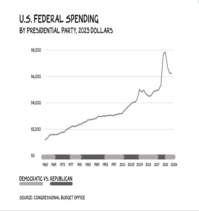
He then uses the image above to illustrate his point.
But it’s a shameful deception, and someone who is a professor ought to know better than to resort to such tactics. Notice how it looks like spending just rises and rises no matter who is in power. But the chart has been subtly shaped to make you think that. The reality, based on the very same chart, is actually quite different.
Notice the row across the bottom, showing who was in power, Democrat or Republican. Though the index shows the same shape, a thick line with rounded corners, on the actual graph the Democrat edges are rounded out while the Republican edges are rounded in.
The net effect is to make it look like the Democrats were in power a lot more than they were. But also, significantly, it makes them look like they were in power while Republicans were doing things. It’s easy to demonstrate how this one small change makes for a very misleading graph.
Let’s add some precision to the graph. I’ve added grid lines over the graph so that one pip in the grid represents one year. Then at the appropriate year, I drew a line signifying the change in administration. As follows:
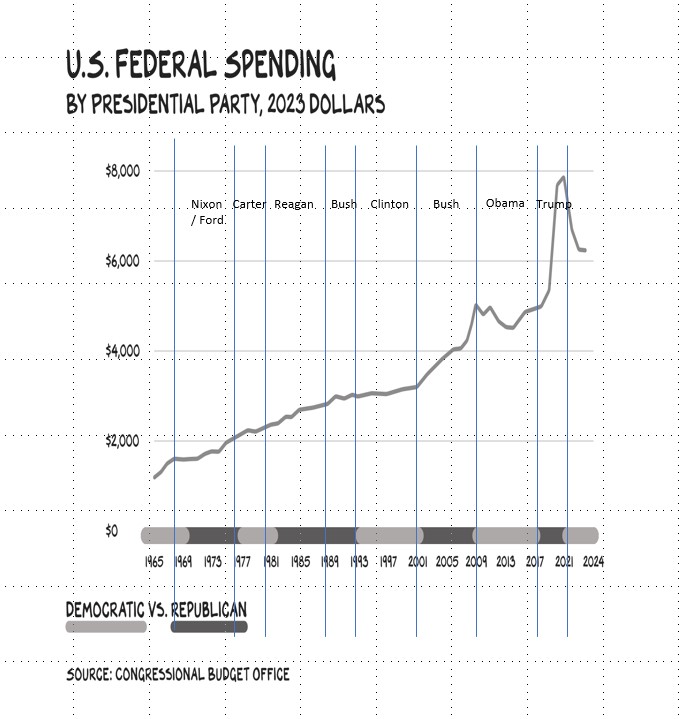
You can already see how the grid lines and dividers clean it up a bit. You can see changes in direction in the spending line corresponding to the change in administration.
But you can also see how the line representing different administrations has been altered even more than we thought. It’s not just that Democrat edges are rounded out and Republicans rounded in, we can see that the length of the shading is manipulated. Clinton’s 8 years are almost as long as Reagan and Bush’s 12! Trump’s 4 years are tiny; Carter’s 4 year term appears almost twice as long.
But why change the lines like this? It’s to make it look like spending increases happened in both Republican and Democrat administrations. But with the lines between administrations mapped much more precisely, we can see just who is responsible for spending increases and who is not. Like so:
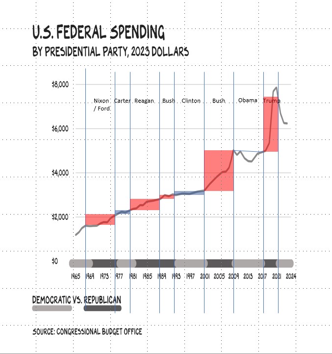
I’ve represented Republican spending increases in red and Democrat increases in blue. Obama’s term is represented with only a line, since spending, according to the chart, actually decreased. I did not shade the Kennedy-Johnson administration because the line doesn’t go back to the beginning, nor did I shade Biden’s, since it doesn’t go to the end.
We can see pretty clearly from the diagram that Republicans dramatically increased spending while in office. Indeed, it’s worth noting that the rate of Reagan’s spending increase is greater than that of Carter and Clinton, before and after him. George H.W. Bush managed to keep increases in line, even while fighting a war. But the second Bush and Trump greatly increased spending, mostly to address problems of their own making.
It doesn’t show in this graph, but Republican presidents also distinguished themselves by cutting taxes, as Galloway mentions. So the difference in overall deficit-creation is even greater than suggested even by the amended graph.
Like I said, a professor ought to know better than to publish something so misleading. If there were any standards, he would be forced to turn in his title.